我们很荣幸地宣布Odoo13.2的发布,这是我们迄今为止最成熟和最完善的版本。你们都知道,在Odoo,我们一直在努力跟上客户在商业管理方面的期望和需求。
这就是为什么我们所有的员工都积极参与为您提供有史以来最好、最复杂的应用程序。我们可以自信地说,odoo13.2是您梦寐以求的满足您业务需求的软件。
让我来指导你完成所有这些改进。您可以在我们的Odoo13.2发布说明中找到更详细的列表。
更强大的会计模块
Odoo会计模块有什么新功能?Odoo新的银行对账功能,管理批量付款的可能性,使用导入功能创建折旧报告的容易程度,我们所有布局和视图的改进,过滤器的清晰度,用户体验的总体改善,与其他模块和应用程序的互连、跟踪支付状态的可能性、新的重构过程、更安全的舍入系数或通用可用性的改进,使会计工作更加高效。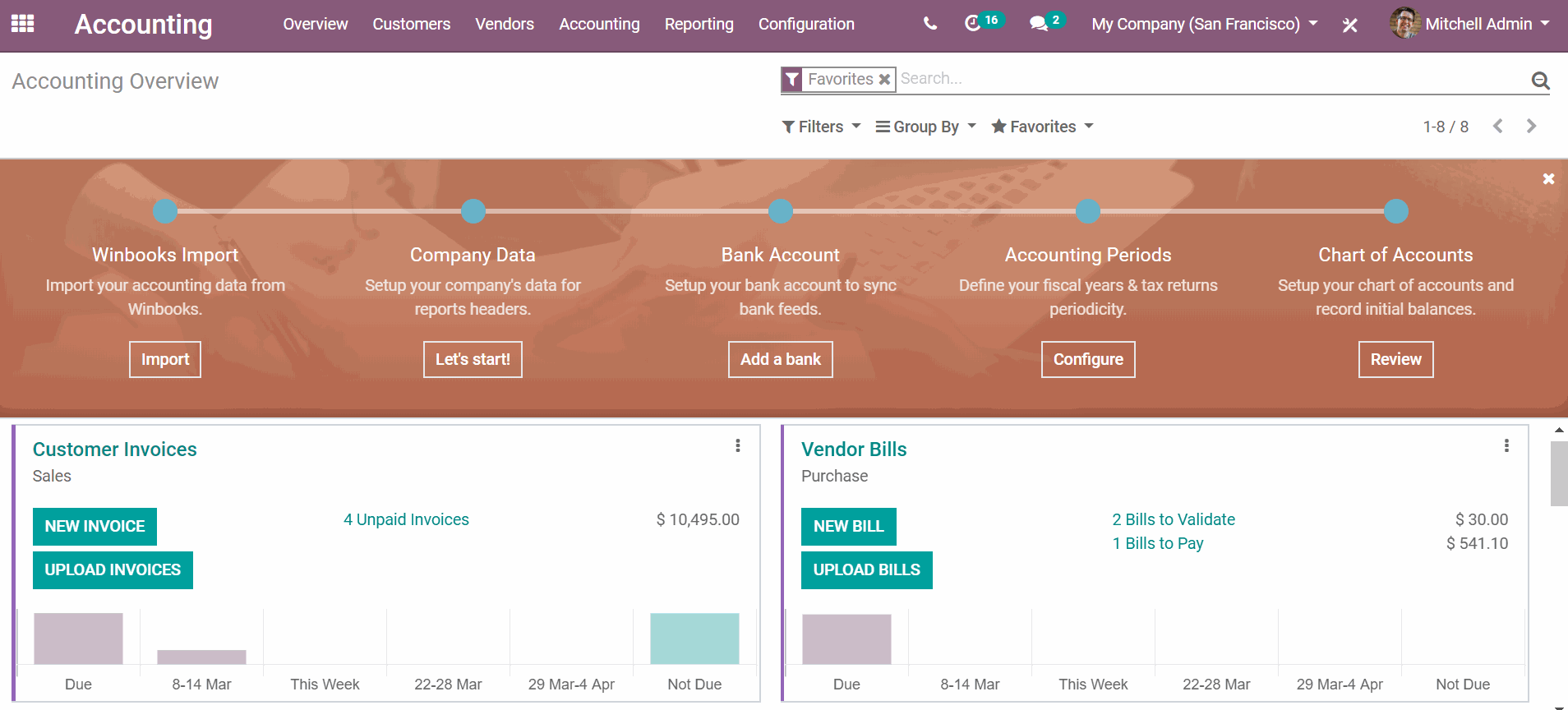
更令人惊叹的网站设计
网站结合了一切你需要的创建,编辑和管理你自己的网站。界面更干净,更具视觉洞察力。事实上,关于所有这些新功能有很多要说的,他们都很棒!这里我举几个例子说明。
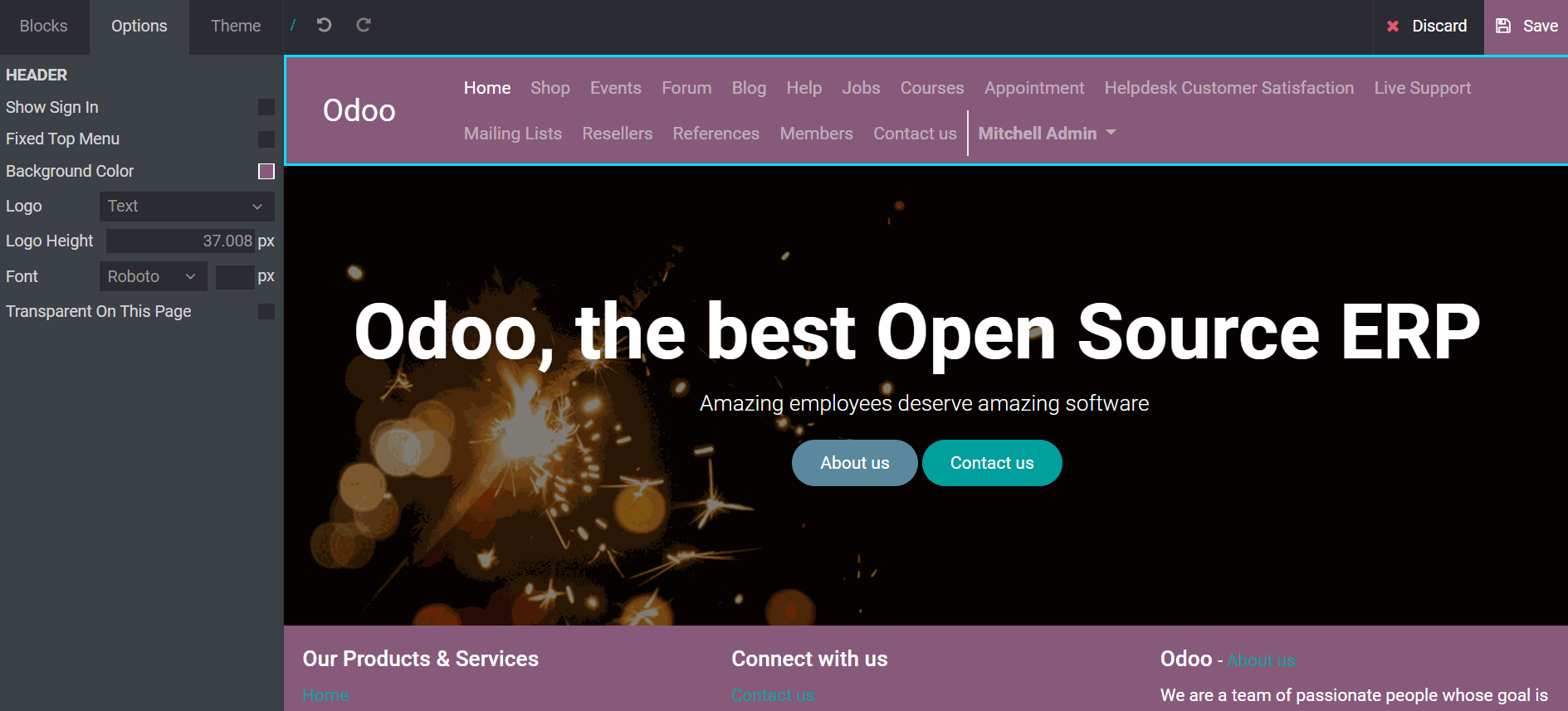
让我们从改进左面板及其相关选项开始。这里有复选框,锚定系统已经过审查,代码段的背景大小和位置已经在模式中配置,现在有了对不可见元素和选项的可视化洞察(Facebook snippet),在carousel snippets选项菜单中添加了一个幻灯片计数器,最后,表单有了新的可能性。
然后,我们来讨论创建、编辑、管理和切换主题的可能性。主题预览现在是全屏显示在同一个标签页上,使用移动开关,默认主题为空,让您的创造力自由发挥,主题可从自定义对话框中切换,有全局片段,没有更具体的片段,最后,网站生成器的所有主题选项现在显示在左侧面板的第三个面板中。一切都是相互关联的!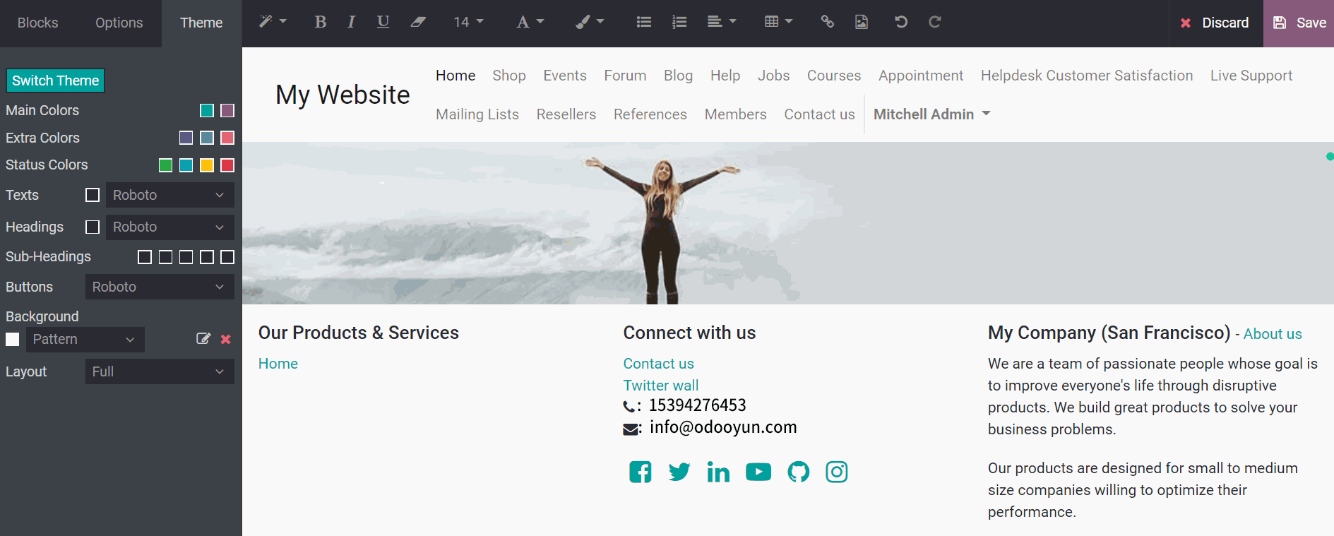
全新的网站建设模块等待你的发现。
更实用的在线学习
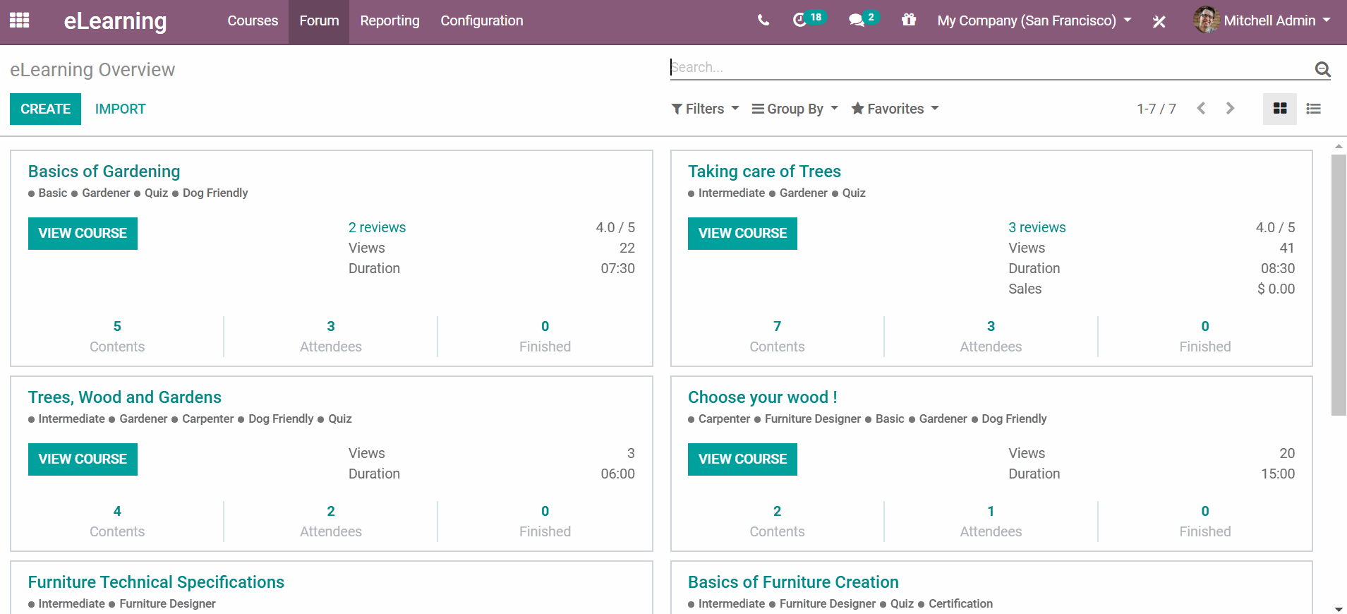
Odoo 在线学习模块结合了您管理课程、认证、测验等所需的一切。通过我们所有新的行动要求,您可以在用户档案中看到所有课程、徽章或证书。
用户现在可以在社交媒体上分享认证。您想跟踪与会者的进度吗?有了Odoo在线学习,你可以每周、每月或每年检查、排名和跟踪用户的发展。最后,如果你有一个建议,你可以在测验中评论任何答案。Odoo 在线学习模块为用户和管理者提供了一个漂亮且易于使用的界面,是您理想的学习管理系统(LMS)!
更高效活动管理模块
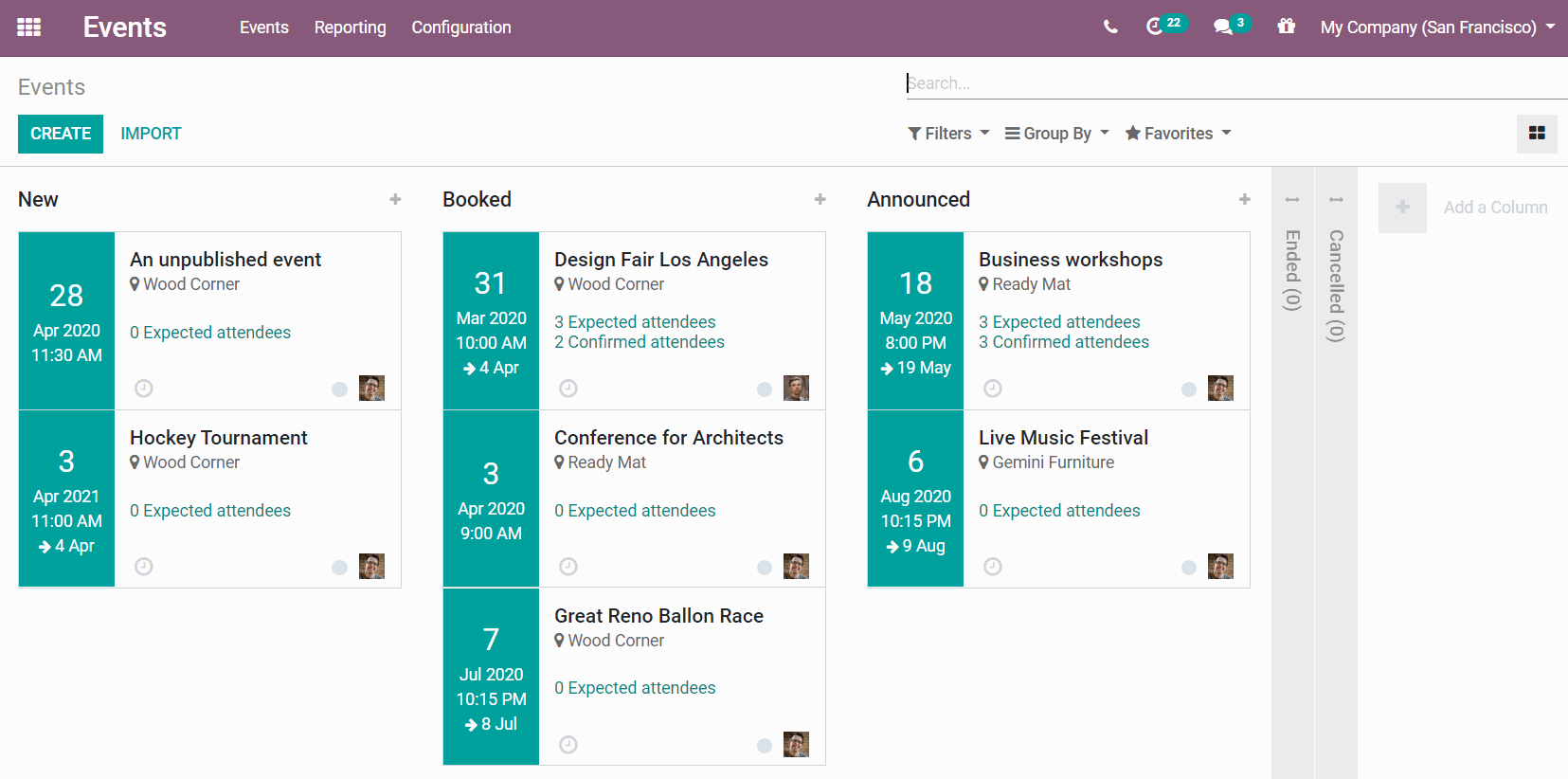
我们的活动看板卡的设计已经过审查。现在,看板视图有了更多的特性和更好的事件调度可用性。
现在可以通过这个看板视图创建您自己的事件管理流。
此外,“甘特图”视图动态计算显示开始日期和比例。 有了Odoo活动事件,在一次点击中管理你的所有事件是前所未有的简单!
更智能的库存管理系统
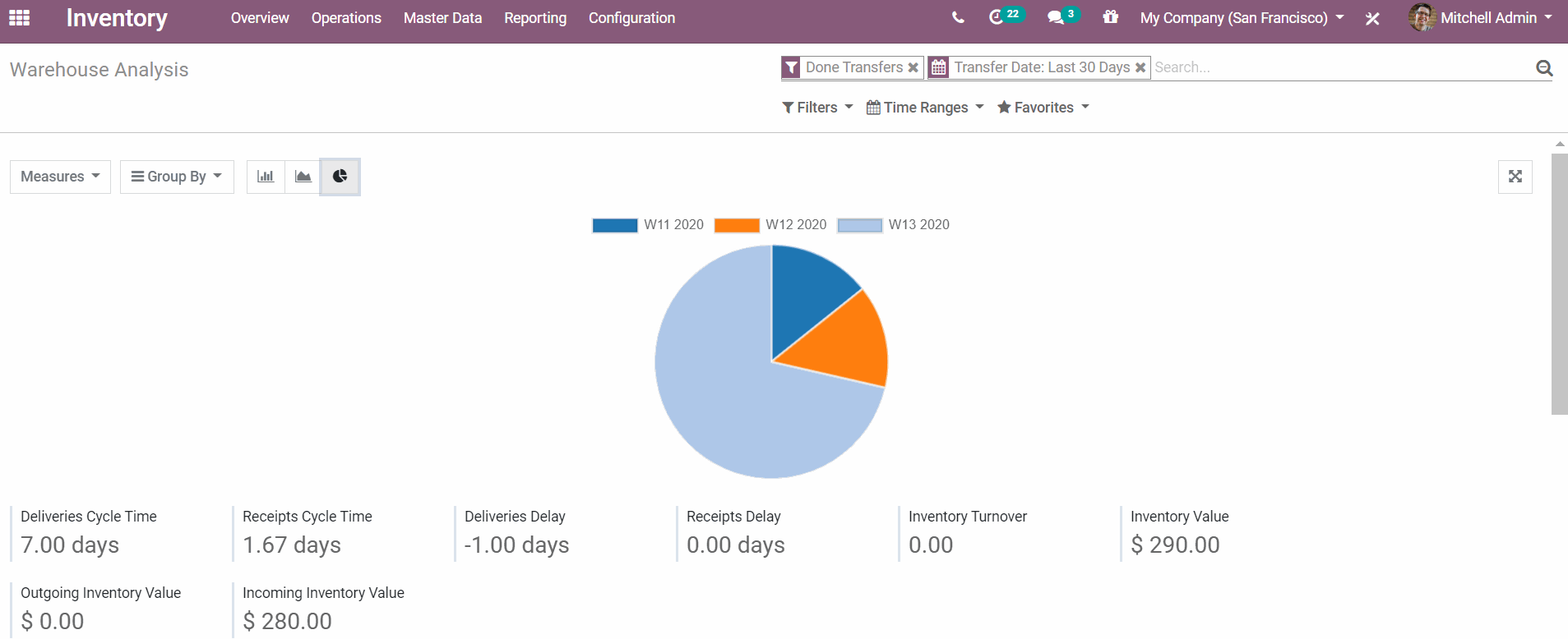
Odoo库存里有很多新东西。例如,可以避免给予会计/帐单访问权限,对于具有过期日期的流程,可用性已得到改进,重新订购规则允许在保持尽可能低的库存成本的同时始终保持最低库存,现在激活签收收货确认的交货,最后,UPS帐户现在已链接到您的客户资料,并允许您直接向他们收费。
事实上,我们的惊人库存应用程序的全球可用性已经过审查。完成任务单上有一个取消创建按钮,一个从产品类别到位置的简单链接,以及传输行为的标准化。更不用说销售订单和销售订单自动创建的采购订单和生产任务单之间有更好的联系。
此外,用户体验已经过重新设计,并且更容易访问。现在,当用户需要更改产品的成本时,他可以避免打开向导,并且可以看到产品的可用数量。一切都已经做了,以方便你使用这个不可思议的应用程序!
更灵活的制造模块管理
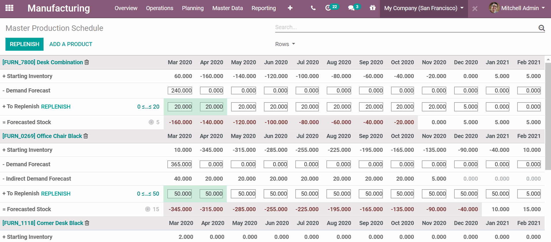
现在,锦上添花,我们的制造应用程序是全新的,具有许多新功能。 首先,我们改进了批量转移的布局和可用性。 这是可用的并链接到我们的条形码应用程序。 与我们的条形码应用程序相关的另一件事是具有跟踪的组件和成品的分包收据管理。 然后,我们扩大了灵活消费的范围,允许更新,以确认MOs和消费所没有的初始BOM和WOs部分组件。
更不用说设置转移和MOs的警报来帮助重新安排时间,WOs可以轻松计划可见性,最后还可以在标记为完成的相同条件下将MOs上的库存过帐。 最后但并非最不重要的一点是,现在可以为几种产品定义相同的质量控制。
本文为译文,原文来源Odoo官网:www.odoo.com/zh_CN/blog/wo-men-de-bo-ke-5/post/meet-odoo-13-2-587
Odoo采用开源商业模式为核心运营,满足企业全方位的业务管理需求,欧度软件江苏有限公司是Odoo中国国内的合作伙伴。Odoo多种部署方式可选,微服务应用模块,以用户为中心,可满足客户关系管理,采购管理,销售管理,库存管理,生产管理,财务管理,供应链管理,人力资源管理,营销管理,网站设计,电子商务,即时通讯及客户服务支持等现代化的企业管理需求。业务数据可视化,动态报表生成,告别重复性的数据整合导出,一站式服务中小企业数字化升级,释放增长潜力。
以下为原文:
At Odoo, we are proud to announce the release of Odoo 13.2, our most mature and elaborated version to date. You all know that, at Odoo, we try to be always up to date regarding the expectations and needs of our customers in terms of business management.
That's why all our employees have been deeply involved in providing you with the best and most sophisticated applications of all time. We can confidently say that Odoo 13.2 is the software you have dreamed of for your business needs.
Let me guide you through all these improvements. You can find a more detailed list on our release note.
Accounting, more powerful
What's new in Accounting? I don't know if this is the new bank reconciliation feature, the possibility to manage batch payments, the ease with which you can create depreciation reports with the import feature, the improvement of all our layout and view, the clarity of our filters, the general improvement of the user experience, the interconnection with other modules and applications, the possibility to track payment status, the new refactoring process, the safer rounding factor or the improvement of the general usability, that makes Accounting even more efficient? Oh wait ... Yes, that's all of that!
Website, more impressive
Website combines everything you need to create, edit and manage your own website. The interface is cleaner with more visual insights. In fact, there is so much to say about all these new features... They are all amazing! So I will do my best to summarize some of them.
Let's begin with the improvement of the left panel and its associated options. There are check-boxes, the anchor system has been reviewed, the background-size and position for snippets have been configured in a modal, there are now visual insights for invisible elements and options (Facebook snippet), a slide counter has been added in the carousel snippets options menu and finally, there are new possibilities for the form. How cool is that?!
After that, let's talk about the possibility to create, edit, manage and switch themes. The theme preview is now full screen in the same tab and with a mobile switch, the default theme is empty and let your creativity runs free, themes are switchable from the customized dialog box, there are global snippets and no more specific ones, and finally, all the theme options of the website builder now appear in the third panel of the left panel. Everything is interconnected!
The Website builder is brand new and waiting for you!!
eLearning, more practical
Odoo eLearning combines everything you need to manage your courses, certifications, quizzes, etc. With all our new calls to action, you will have the possibility to see all courses, badges or certifications on the user profile.
Are you proud of your results? Great! Users can now share certifications on social media. Do you want to follow the progress of your attendees? Coool! With Odoo eLearning, you can check, rank and track the evolution of your users by week, month or year. Finally, if you have a suggestion, you can comment any answers on a quiz. With a beautiful and easy-to-use interface for users and managers, Odoo eLearning is the perfect Learning Management System (LMS) for you!
Events, more efficient
The design of our Events Kanban card has been reviewed. Now, the Kanban view has more features and better usability for events scheduling. It is now possible to create your own event management flow via this Kanban view.
In addition, the Gantt view dynamically computes the display start date and scale.
With Odoo Events, it has never been easier to manage all your events in one click!
Inventory, more intelligent
There are a lot of new things in Inventory. For example, it is possible to avoid giving accounting / billing access, the usability has been improved regarding flows with expiration dates, the reordering rules allow to always have a minimum stock while keeping the inventory cost as low as possible, deliveries signed for acknowledgement of receipt are now activated and finally, UPS accounts are now linked to your customer profile and allow you to bill them directly.
In fact, the global usability of our amazing Inventory app has been reviewed. There are an un-build button on done MOs, an easy link to locations from the product category and a standardization of transfers behavior. Not to mention that there is a better link between the SO and the PO / MO created automatically by the SO, as well as by the MO.
Furthermore, the user experience has been redesigned and is more accessible. Now, when a user has to change the cost of a product, he avoids to open a wizard and also, he can see the available quantity of products. Everything has been done to facilitate your use of this incredible app!
Manufacturing, more resourceful
Now, the icing on the cake, our Manufacturing app is brand new with lots of new features. First, we have improved the layout and usability of batch transfers. This is available and linked to our Barcode app. Another thing that is related to our Barcode app is the management of subcontract receipts with tracked components and finished products. Then, we broadened the scope of flexible consumption, allowing updates to confirm MOs and consume components that weren't part of the initial BOM and WOs. Not to mention the setting up of alerts on transfers and MOs to help rescheduling, the ease of WOs planning visibility and finally, the possibility to post an inventory on a MO under the same condition as marked as done. Last but not least, it is now possible to define the same quality control for several products. How convenient is that?!
Not convinced?
This description was an appetizer. I hope your interest is at its maximum!
I invite you to discover all our new features in our release note. Have fun!
